Briana McCarthy
Crayola


Audience:
• Kids age 8-11
• Tend to cling to at least one thing to really define themselves
• Like having decorative or cool classroom supplies (makes school more fun)
• Imaginative. Believe they can do or be anything
• Start to define themselves within a group
• Like to make their own choices
These ads give kids a way to further define who they are. Kids are constantly trying to define themselves and find their niche in the world, classroom, or group of friends. They are also filled to the brim with imagination and possibilities. They base who they are off what important adults in their lives say, what their older sibling or role models are doing, and what their friends like. They want to show everyone why they are different or special. These ads promise a way to express themselves and help them choose their own identity.
Within these ads there is a simple challenge for the child to define themselves as Crayola has defined its crayons. Are you a trouble maker? A Ninja? A Superstar? It is up to the child to decide.
Each ad contains a crayon or crayons that are given a personality through drawing or position, color, and title. They are meant to be playful and fun. What child doesn’t give identity to their belongings? A sparkly purple crayon may be a superstar, so a child that fancies herself/himself a superstar will want that crayon. They will feel a sense of identity is being displayed by owning those particular crayons or Crayola products.
Detroit Zoo: Children's Day


Audience:
• Parents with kids age 2-12
• Time spent with children varies from a lot to very little
• Enjoy having kids and spending time with them
• Two or single parents
• Most work
These ads inform parents about a special day at the zoo that is focused on kids. They appeal to the parents’ desire to make their children happy and spend time with them. The idea is that if you bring your kids to the zoo on this day, they will be happy and you will be happy.
Photographs of children are paired with a clever headline that compares the kids to the animals. The imagery and text is playful and friendly to show that the zoo has affection for kids. The ads will also connect with parents saying that kids can be wild and crazy but we still love them. They show an understanding of how the parents may feel at times about their children but that there is always an underlying affection and love.
Finland’s Naked Ant Hill Sitting Competition

Audience:
• Males, age 17-26
• Like to party
• Would go on Fear Factor
• Are rough and rowdy
• Live life on the edge
This ad is meant to inform the audience of yet another crazy, extreme event that they need to try. The name itself screams extreme. The ad promises that the competition will be intense and most likely painful. The question becomes, “Which of you is insane enough and tough enough to try it?” This appeals to the audience’s sense of image: how they see themselves and how they want others to see them. They want to be the toughest, coolest guy around.
The ad is illustrated in a palette of black, white, and red. This simple color mix can be associated with anarchy and some serious toughness. The copy is written from the ants’ perspective. The ants’ express the views they hold after the competition has taken place. The ants are also a metaphor for the contestants as they speak in a similar style as the audience.
Fuji Finepix


Audience:
• male/female age 16-27
• Loves to hang out with friends
• Usually has a camera with them
• A student
Two of the features of the camera are that it is small and quiet. The idea is that you can easily take candid shots. This is appealing to a group of people that are quite socially involved. Many have accounts on social networking sites and love to post funny images there.
The Paparazzo ads are playing off the sneaky aspect of the camera. These ads are saying that this camera makes the funny candid shot possible. The tone is that of a fellow mischief maker encouraging others to make mischief. There is a sort of challenge presented in the line “Find the Paparazzo in you”. Fuji is saying “go, take a picture of the priest sleeping in church”, “catch people unawares, if only for your own entertainment”.
Visually the ads keep a simple color palette. The main image is full page black and white. Black and white photography seemed the best fit to make an association with Paparazzi and spy photography. Also, the simple palette is cool and gives the camera a certain prestige in the eyes of the audience: This isn’t just some point and shoot camera. It’s a fine tuned piece of equipment.
Domestic Violence


Audience:
• The bystander-male and female
• They see abuse and may or may not take action
These ads appeal on an emotional level. They portray the trapped feeling that many victims feel and try to express that to the viewer. There is also a call to action. A website address that will provide facts about abuse and ways to report or stop abuse is in the bottom corner of each ad. The audience now has resources that will allow them to be educated and act when a situation occurs.
The ads are full page imagery couple with text. Two of the ads speak of abuse within a relationship. Couples are asleep and the text alludes to the fact that the victim’s nightmares occur while she is awake. Also, the males in the images are wrapped around the bruised females, trapping them and controlling them.
The third ad addresses child abuse. Again, the little girl is asleep. There is a shadow cast over her in the form of a wolf hand puppet. The text plays off of the “big bad wolf” from the fairytales. The hands that make the shadow puppet, the person that tells the fairytales is the one that harms the child. She lives with, is trapped with, the evil from her story books. Those hands could belong to anyone that the child should be able to trust and not fear.
The Mangosteen


Audience:
• Male and female, Age 25-45
• Health conscious
• Adventurous and brave about trying new foods
• Very much “individuals”
These ads focus on the image and humor of the audience and how they feel about themselves. They see themselves as a different breed and are truly living life to the fullest. They are always trying new things to improve health or prevent negative health issues, even if they don’t really need to. The ads present a fruit that tastes good and has many health benefits.
The ads are photographic and humorous. The images fill the page and present a person or people doing something crazy or strange but enjoying themselves. The people in the images are confident and healthy. The audience should find humor in the images and agree that they are looking at something strange but enjoying it. The people in the images are doing strange things because the fruit itself looks rather strange and unfamiliar. The tag line, “deliciously strange”, plays off the idea that strange can be good and fulfilling: we may laugh at it, but we kind of want to try it.
New Zealand


Audience:
• males and females age 20-40
• Enjoy learning and have a college degree or are in the process of attaining one
• Believe in living life to the fullest through experiences
These ads promise adventure and cultural experiences. The idea is that visiting New Zealand will be the greatest, most exhilarating adventure of your life.
The ad speaks to the viewer as someone who has already taken the trip and loved it. The trip changed them and invigorated them. The tone of the ad is friendly and enthusiastic. The person speaking about their trip is someone that lives life for all it is worth; someone the audience sees themselves as or someone they want to be. The speaker went to New Zealand and was immersed in culture and adventure and will never be the same.
The visual requires the audience to work a little to unravel the puzzle of what they are seeing. They will be drawn in by the vibrant kiwi image. The kiwi is a fruit associated with New Zealand and nickname for native New Zealanders. The center of the kiwi was altered to resemble the shape of the country and certain towns were pointed out for some of the things they are known for. The lines of the kiwi all draw you toward New Zealand at the center. New Zealand also draws planes, actually the people on them, toward it. New Zealand will draw you there and give you an amazing experience. By not using a real map, I hope to preserve the idea of mystery and adventure that can be sought and had in the country. Also, New Zealand slang was used to stir people’s interest in the reading and to further allude to the cultural experience.
Craig's List

Audience:
• Individuals or companies that are looking for creative staff or a freelance artist
This ad is an anecdote from my childhood that provides a glimpse into my personality and creativity. The ad is a demonstration of my creative skills which are backed up later when it is stated that I graduated from college with a degree in Art and Advertising.
The tone of the ad is conversational as I recount some childhood memories and thoughts on those times. These remembrances are things that many can relate to because most of us went through multiple “when I grow up” phases. By reading this piece, the audience may make a connection with my memories and be reminded of their own experiences and childhood fancies. In this way, I may be able to make an impression and be remembered.
Concert Poster: Not My Day
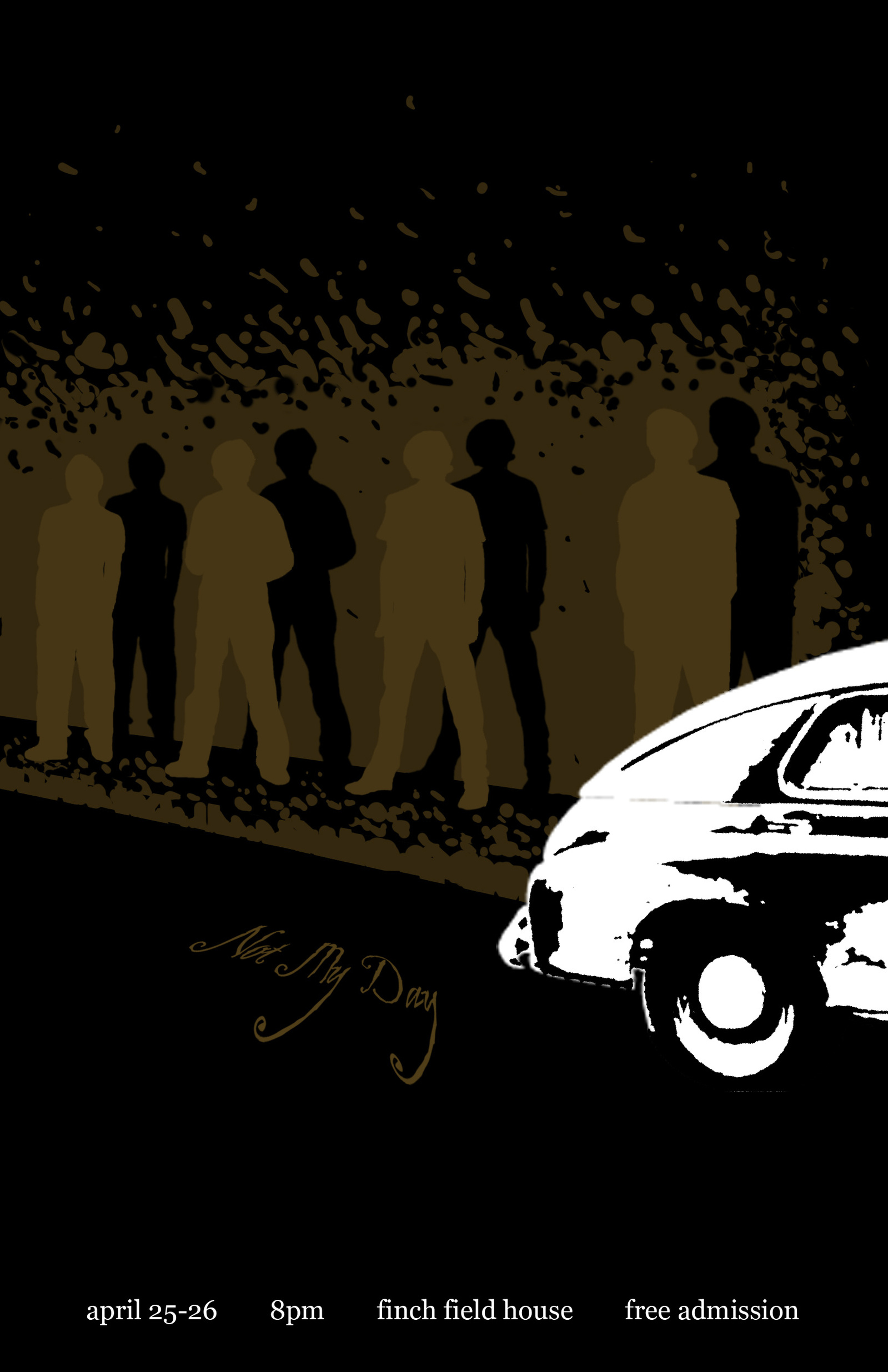

Audience:
• College students
• Enjoy alternative/pop/punk/rock
• Most likely have not heard of “Not My Day”
The message is that there is a band called “Not My Day” playing on Friday and Saturday and you need to come find out who they are: you’ll like them. The imagery describes the band, their attitude, and what their music sounds like. The graphic design is something that will appeal to the audience, especially in a campus setting. The art style and design does a lot for creating band identity. The poster isn’t just a bunch of photographs slapped together. There was time and thought put into the image which leads to the idea that the music isn’t just a rag tag jumble either.
“Not My Day” comes out of the United Kingdom and describes their genre as power pop/indie/rock. Their music style reminded me of a dirtier version of the Beatles. To give the audience an idea of that sound I played off some associations they may have with that type of music. There is a lot of Beatles imagery that is illustrated and incorporates silhouettes. I used similar imagery for “Not My Day” with a twist. The imagery plays off the name of the group with a cheeky bit of humor.
CMU: First Best Only
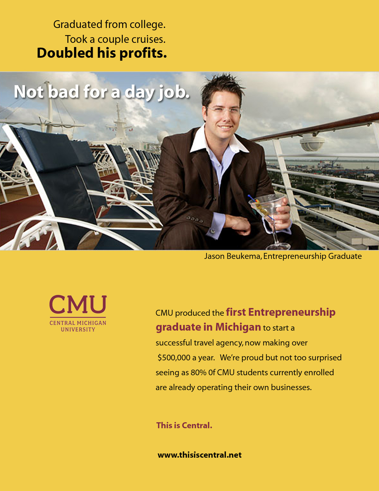
Audience:
- Potential college students (high school)
This was a project that helped support the CMU marketing department as they did research for the "First, Best, Only" project. The aim was to highlight CMU graduates that were the first, only, or best at something. Highlighting such successes allows the potential student to imagine their own future success and how that can be accomplished at CMU.